Aftercare Cleaning

Challenge
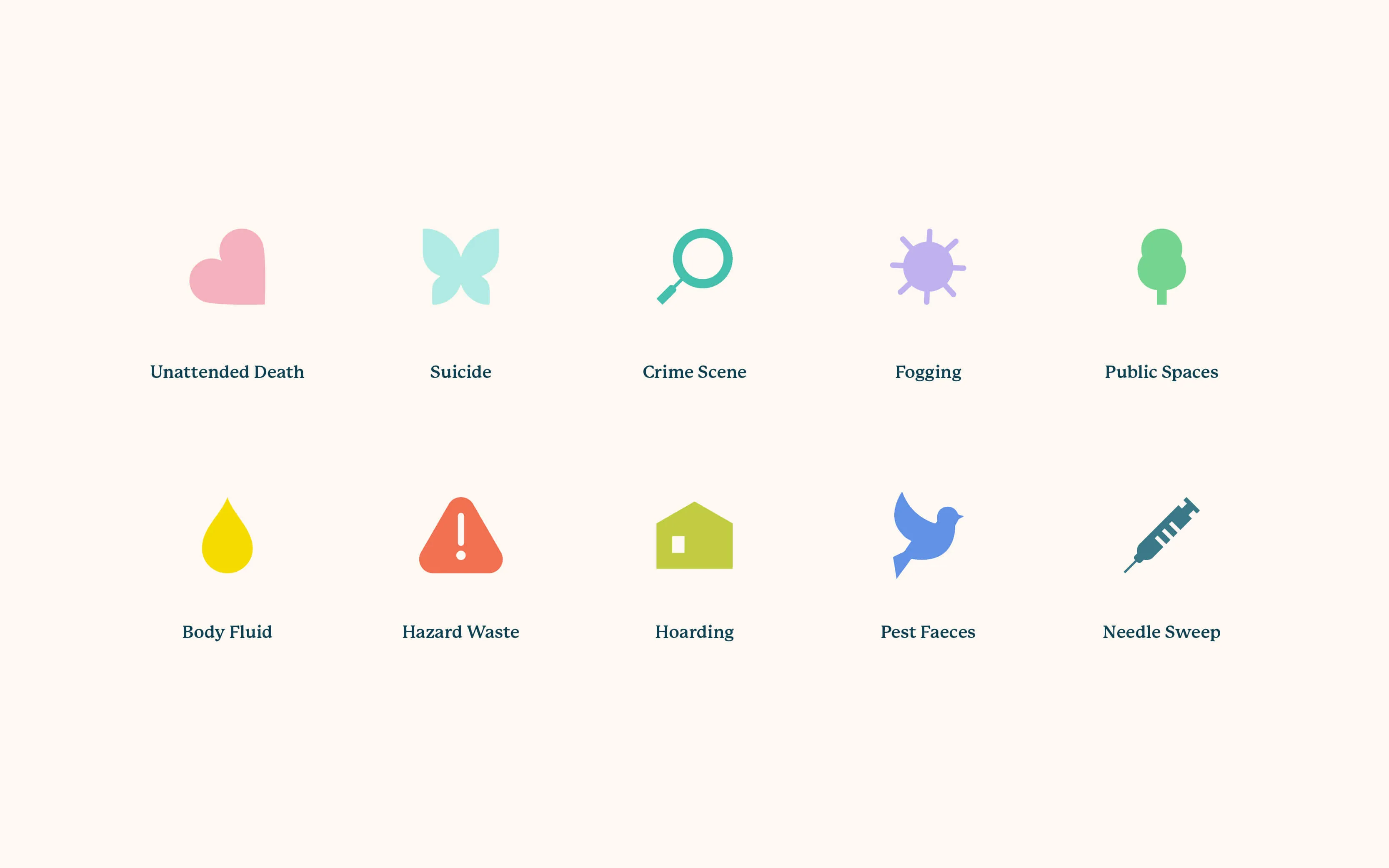
Aftercare is a specialist cleaning company that deals with post-trauma situations including crime scenes, suicides and more. Having previously offered these services under the brand of a general cleaning company, Aftercare is technically a new startup but the team have bags of experience and they know first hand what clients are going through in these challenging times.
Solution
The Aftercare brand is a perfect representation of the team - calm, compassionate and caring. The website experience helps distressed clients find the help they need, with the messaging speaking directly to the user with genuine empathy. Elsewhere in this industry, you see a lot of imagery of police cordons, hazmat suits, blood, needles and worse. These sites are the antithesis of what these clients need: Triggering imagery, cold branding, busy interface, transactional approach. Aftercare set out to do things differently with their branding, as they do with all other facets of the business.
Recognition


.webp)
